It’s #BrandTuesday!
From this month, I will discipline myself to blog one post a day. And on Tuesdays I will take some updates related to what goes on with my “brands”. And maybe conversations about brands in general.
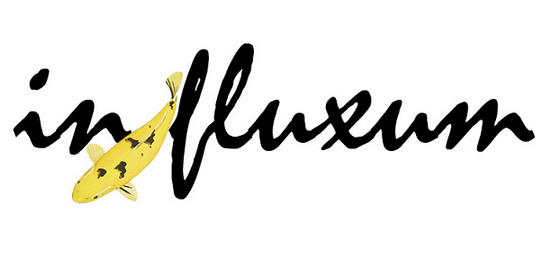
What could be better than to tell a little story about the logotype for my new venturing in the name of InFluxum!
First out – a brand is not a logotype. It is far more wider than so. But it is a symbolic reflection about what the brand “stands for”. Thus, of importance.
What is seen, is a carp, a Koi Fish, of the type Ki-Bekko. In fact, one of the rarest types of Koi Fish. Full story here. And, the harmony associated with swimming in that Zen Garden Pond among the rocks and in the water, is what I want to reach with my deeds in the name of InFluxum. Feel safe in the water, and not unsecure in the storms.
(UPDATE: The typeface is Mistral)
My beloved Karin has designed the logotype. Love you forever, but you know that already, don’t you? :)

I do :)
only 1 zippered pocket buying a product stamped brand Chanel onto it.